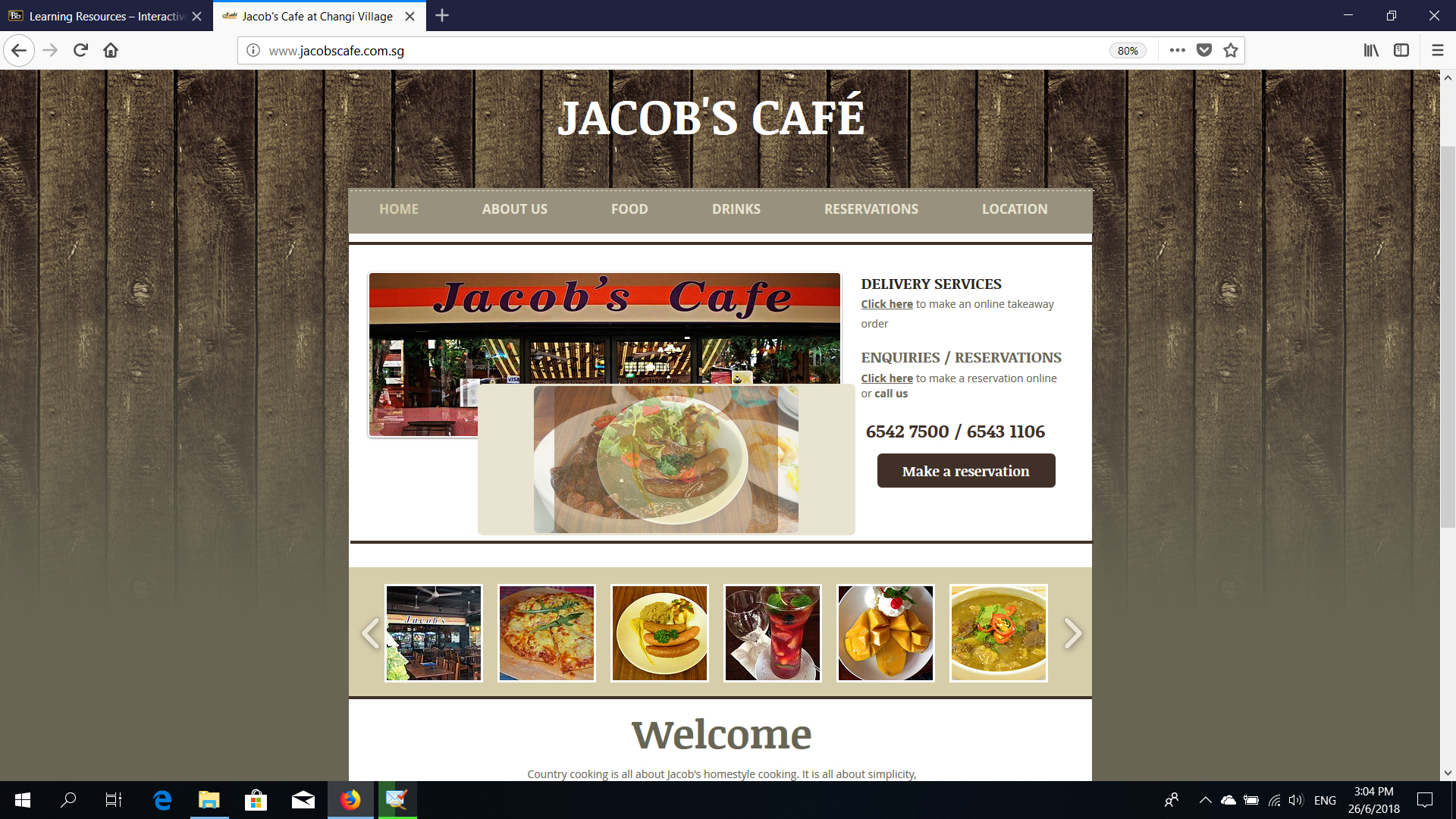
Visual Aesthetics - www.jacobscafe.com.sg
Visual Appeal/Personality/Color Scheme
I think the overall look of the website can be much improved.The website layout of Jacob's Cafe is a very simple plain wooden cottage background. For visual Appeal aspect, the website is very earthly pasteled based colour scheme with the wooden fencing, brownish Grey theme. The feeling of the website gives basic confidence to the patron that this entity does able to offer what it actually shows on the website. No colour scheme i felt, very monotone and boring feel.
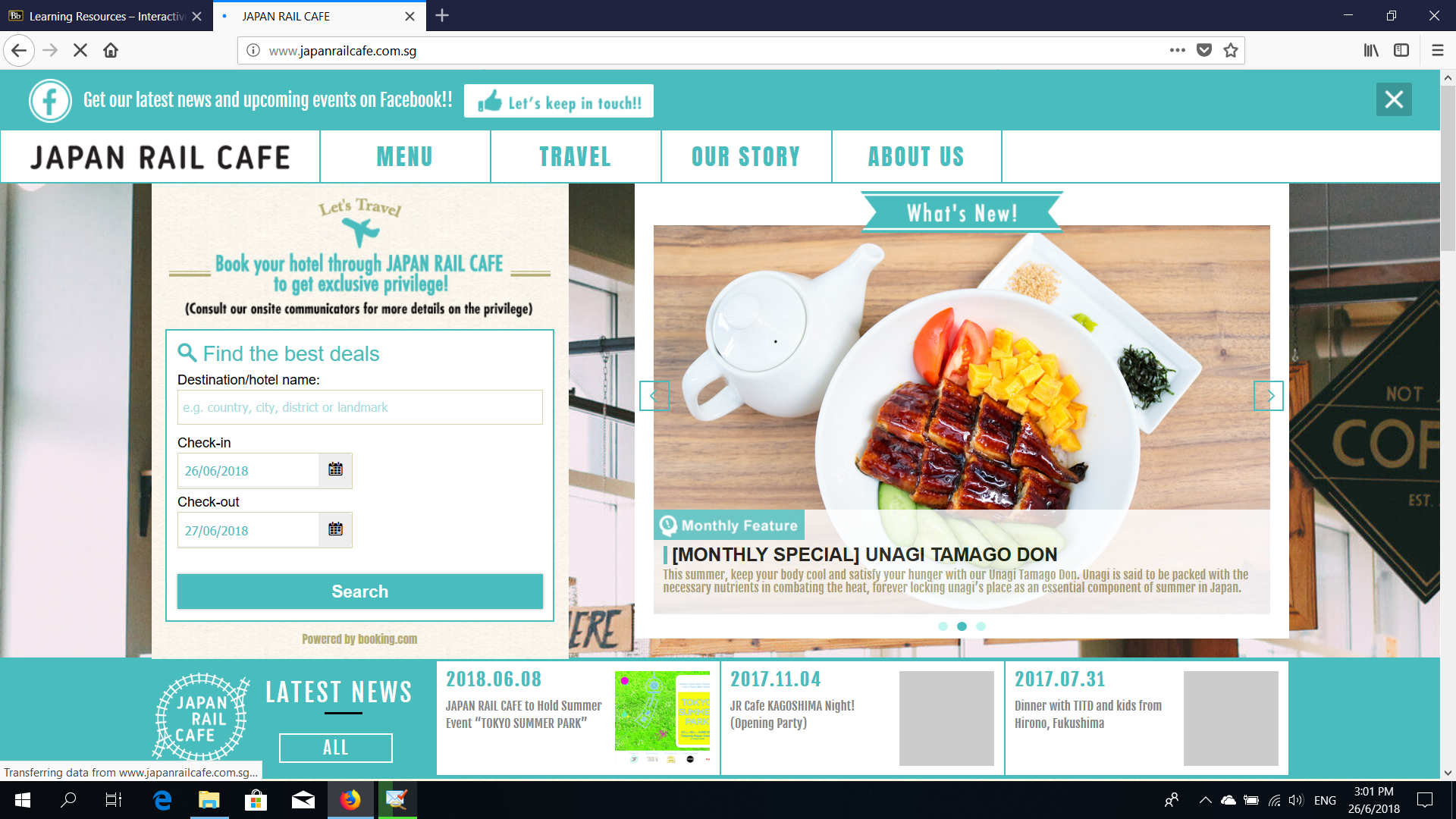
Visual Aesthetics - www.japanrailcafe.com.sg
Visual Appeal/Personality/Color Scheme
The website gives a very sky blue colour theme. A light cosy feeling. The website gives a very sky blue colour theme. A light cosy feeling. I think the overall look of the website is using a responsive or interactive theme by a wordpress theme that makes the website so good and alive the roll-over effects. I love the embedding of the Facebook Page widget in the front page of the website to make it so social media friendly and updated moderna feeling.
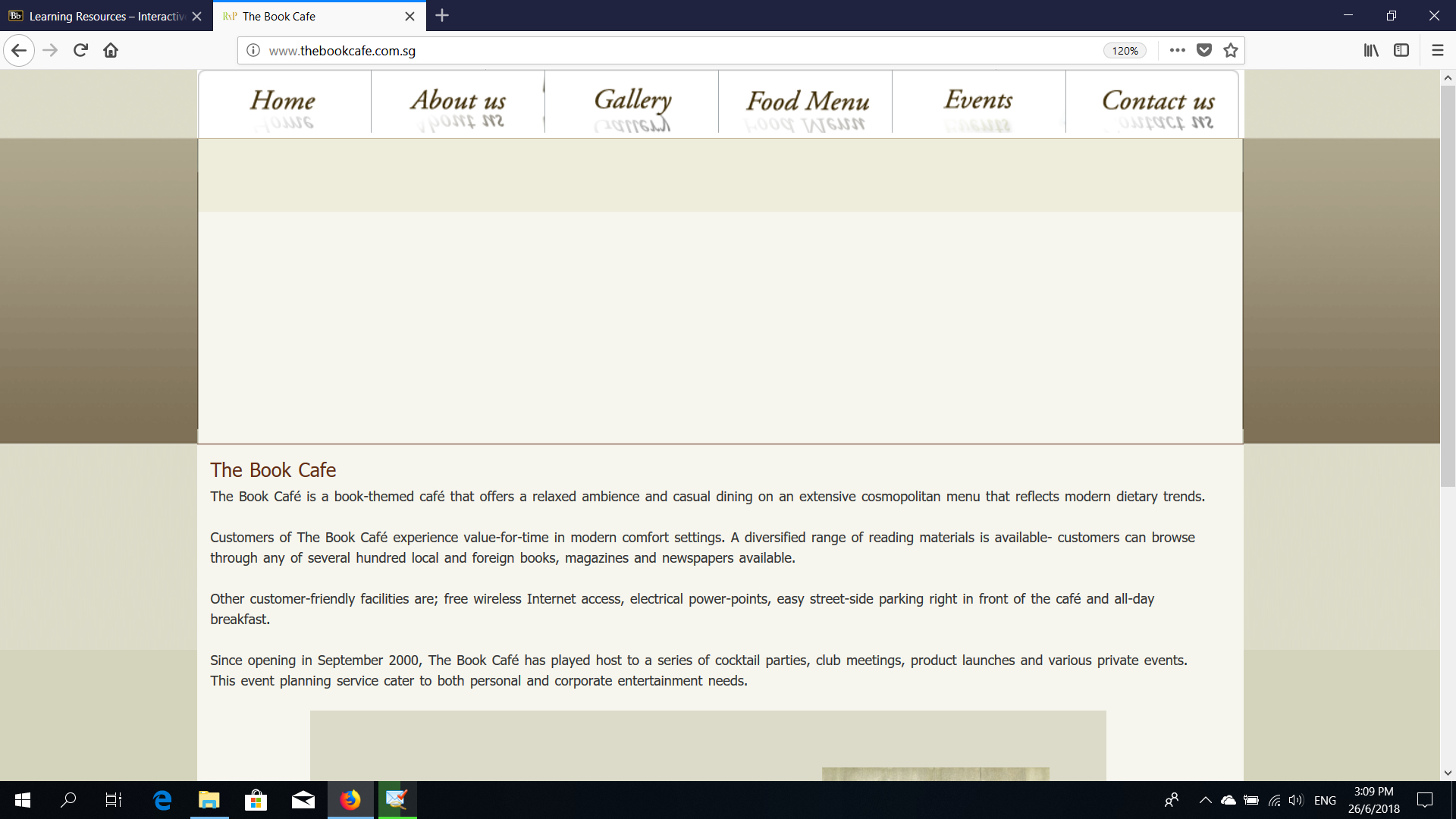
Visual Aesthetics - www.thebookcafe.com.sg
Visual Appeal/Personality/Color Scheme
I think the overall look of the website can be much improved to a responsive or interactive theme by a wordpress theme perhaps to bring alive the roll-over effects. The website layout of The Book Cafe is a very simple plain pastel background. For visual Appeal aspect, the website is greying cream brown pasteled based colour scheme no background or tiled effects The feeling of the website gives some basic confidence to the patron that this entity does able to offer what it actually shows on the website but outdated feeling, until and unless they view the food menu page when click on the food menu with over 11 sub menu category. No colour scheme i felt, very monotone and boring feel.
Browser Compatibility
This website has been tested in the following browsers:
- Internet Explorer 11 , FireFox, Google Chrome 35